Get a head start on your coding projects with our Python Code Generator. Perfect for those times when you need a quick solution. Don't wait, try it today!
Idea and Zipf's Law
In this tutorial, we will use Python and its plotting module matplotlib to illustrate the word frequency distributions of texts. This is called Zipf's Law, which states that the frequency of words is inversely proportional to their rank and the most common word.
So this means the second most frequent word is half as frequent as the most common, the third one is one-third as common as the most common, and so on. We will analyze texts and show these frequencies in a line graph.
To get started, let's install matplotlib, NumPy, and scipy:
$ pip install numpy matplotlib scipyImports
Let us start by importing some modules to help create this program. First, we get os so we can list all the files in a directory with the os.list_dir() function because we make it so we can dump .txt files in a specific folder, and our program will include them dynamically. Next, we get pyplot from matplotlib, the simple non-object-oriented API for matplotlib.
After that, we get string which we need because we will remove all the text punctuation, and we can use a string in this module. The subsequent two imports are done so we can later smooth out the curve:
# Imports
import os
from matplotlib import pyplot as plt
import string
import numpy as np
from scipy.interpolate import make_interp_spline
Setup
Next up, we setup up some variables. texts will hold the texts of the files accessible by their filename without the extension. The next one is pretty similar. It will just have the length of each text. textwordamount will hold another dictionary where each key represents a word and the value of its number of occurrences in the text. After that, we get the punctuation variable from string and store the list in a variable:
# define some dictionaries
texts = {}
textlengths = {}
textwordamounts = {}

unwantedCharacters = list(string.punctuation)
After that, we also define how deep we want to go with the check of the occurrences, and we also define the x-axis because it will always be the same ranging from 1 to 10 (or whatever we specified as depth):
# How many ranks well show
depth = 10
xAxis = [str(number) for number in range(1, depth+1)]
Getting the Texts
After the setup, we can finally start by getting the texts. For this, we first need the filenames of all files in the texts folder. You can name this whatever you want. Then we loop over these names, open them, and read their content into the texts dictionary. We set the key to be path.split('.')[] so we get the file name without the extension:
# Getting all files in text folder
filePaths = os.listdir('texts')
# Getting text from .txt files in folder
for path in filePaths:
    with open(os.path.join('texts', path), 'r', encoding='UTF-8') as f:
        texts[path.split('.')[0]] = f.read()
Cleaning the Texts and Counting the words
Now we continue cleaning the texts of unwanted characters and counting the words. So we loop over each key in the dictionary, and for this loop, respectively, we loop over each undesirable character, replace it in the text, and set the text at the specified key/value pair to this new and cleaned string:
# Cleaning and counting the Text
for text in texts:
    # Remove unwanted characters from the texts
    for character in unwantedCharacters:
        texts[text] = texts[text].replace(character, '').lower()
After that, we split the text by empty spaces and save the length of this list to our textlengths dictionary:
    splittedText = texts[text].split(' ')
    # Saving the text length to show in the label of the line later
    textlengths[text] = len(splittedText)
Continuing, we make a new dictionary in the textwordamounts dict to store the occurrences for each word. After that, we start a loop over the words of the current text:
    # Here will be the amount of occurence of each word stored
    textwordamounts[text] = {}
    # Loop through all words in the text
    for i in splittedText:
Then we check if the current word is in the dictionary already. If that's the case, we increment up by one, and if not, we set the value to one, starting to count from here:
        # Add to the word at the given position if it already exists
        # Else set the amount to one essentially making a new item in the dict
        if i in textwordamounts[text].keys():
            textwordamounts[text][i] += 1
        else:
            textwordamounts[text][i] = 1
After that, we sort the dictionary with the sorted() function. We transform the dict into a list of two-item tuples. We can also define a custom key that we have to set to the second item of the supplied objects. It's a mouthful. We do this with a lambda. We only get a limited number of items back specified by depth.
    # Sorting the dict by the values with sorted
    # define custom key so the function knows what to use when sorting
    textwordamounts[text] = dict(
        sorted(
            textwordamounts[text ].items(),
            key=lambda x: x[1],
            reverse=True)[0:depth]
        )
Helper Functions
Now we make two helper functions. We start with the percentify() function. This one is pretty simple. It accepts the value and the max, and it calculates the percentage.
# Get the percentage value of a given max value
def percentify(value, max):
    return round(value / max * 100)
The following function is used to smoothen out the curves generated by the word occurrences. We won't go in-depth here because this is purely cosmetic, but the takeaway is that we use NumPy arrays and make_interp_spline() to smooth it out. In the end, we return the new x and y-axis.
# Generate smooth curvess
def smoothify(yInput):
    x = np.array(range(0, depth))
    y = np.array(yInput)
    # define x as 600 equally spaced values between the min and max of original x
    x_smooth = np.linspace(x.min(), x.max(), 600)
    # define spline with degree k=3, which determines the amount of wiggle
    spl = make_interp_spline(x, y, k=3)
    y_smooth = spl(x_smooth)
    # Return the x and y axis
    return x_smooth, y_smooth
Perfect Zipf Curve
So we can compare our texts with Zipf, we now also make a perfect Zipf curve. We do this with a list comprehension that will give us values like this: [100, 50, 33, 25, 20, ...]. We then use the smoothify() function with this list, and we save the x and y axis to use it then in the plot() function of pyplot. We also set the line style to dotted and the color to grey:
# Make the perfect Curve
ziffianCurveValues = [100/i for i in range(1, depth+1)]
x, y = smoothify(ziffianCurveValues)
plt.plot(x, y, label='Ziffian Curve', ls=':', color='grey')
Displaying the Data
Let us finally get to display the data. To do this, we loop over the textwordamounts dictionary, and we get the value of the first item, which will be the most common word for each text.
# Plot the texts
for i in textwordamounts:
    maxValue = list(textwordamounts[i].values())[0]
Then we use our percentify() function with each value of the amount dict. Now, of course, for the most common value, this will return 100 because it is the most common one, and it is checked against itself.
yAxis = [percentify(value, maxValue) for value in list(textwordamounts[i].values())]After that, we use this newly made y-axis and pass it to our smoothify() function.
x, y = smoothify(yAxis)Last but not least, we plot the data we made and give it a label that shows the text name and the word amount. We set the opacity with the alpha parameter.
plt.plot(x, y, label=i+f' [{textlengths[i]}]', lw=1, alpha=0.5)Cleanup
And after the plotting loop, we set the x ticks to look correct. We call the legend() function, so all the labels are shown, and we save the plot with a high dpi to our disk. And in the very end, we show the plot we just made with show().
plt.xticks(range(0, depth), xAxis)

plt.legend()
plt.savefig('wordamounts.png', dpi=300)
plt.show()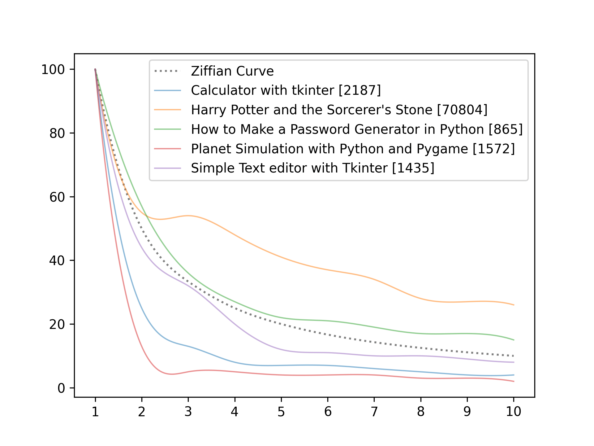
Showcase
Below you see the showcase of our little program. As you see, we dump many text files in the texts folders and then run the program. As you see. Password generator tutorial and Simple Text Editor with Tkinter are pretty close to the perfect curve, while Planet Simulation with PyGame is way off.
Conclusion
Excellent! You have successfully created a plot using Python code! See how you can analyze other data with this knowledge!
Learn also: How to Create Plots with Plotly In Python.
Happy coding ♥
Just finished the article? Now, boost your next project with our Python Code Generator. Discover a faster, smarter way to code.
View Full Code Explain The Code for Me


Got a coding query or need some guidance before you comment? Check out this Python Code Assistant for expert advice and handy tips. It's like having a coding tutor right in your fingertips!