Get a head start on your coding projects with our Python Code Generator. Perfect for those times when you need a quick solution. Don't wait, try it today!
Introduction
As more and more AI models are put into production to make business decisions, the need for Explainable Artificial Intelligence (XAI) is growing. As a result, these choices affect a large number of people. This might have positive or negative effects.
So, it's critical to understand the fundamental factors that influence these choices. Adopting artificial intelligence (AI) models has been gradual in the industry since the AI model's decision cannot be justified.
This tutorial aims to unbox the so-called black-box models to promote flexibility, interpretability, and explainability of the choices made by AI algorithms. It seeks to describe AI models in simple terms.
Establishing the Framework
Artificial Intelligence (AI) solutions are being developed across various industries, including retail, banking, financial services, insurance, healthcare, manufacturing, and Internet of Things-based businesses.
AI is at the heart of a wide range of new commodities emerging as businesses increasingly digitize their operations.
Because intelligent robots are increasingly capable of learning, thinking, and adapting, AI is at the heart of these products and solutions.
On the other hand, experimentation is rare.
Suppose we can harness clever people's vast knowledge and experience and apply it to a machine-based learning and reasoning system. In that case, we can significantly increase the effectiveness of learning.
As a result of these capabilities, today's machine and deep learning models can solve complex business challenges with new performance levels, generating business results.
AutoML (Automatic Machine Learning) tools, frameworks, minimal code, and no code (minimum human interaction) tools have been developed in the previous two years. In other words, this represents a near-zero human involvement in developing and implementing solutions.
It's essential to know how the machines arrived at their conclusions when computers' decisions are entirely made, and people are constantly at the receiving end. 'Black box models,' as they are often called, underlie most artificial intelligence systems. Since AI models make predictions, there is a requirement for model explanation and interpretability.
Artificial Intelligence
By "artificial intelligence," we mean creating a computer program capable of autonomously doing human tasks by making decisions on their own without the need for human intervention. We may use a computer program to create an artificial intelligence system to make intelligent conclusions about a problem statement. There are two main approaches to building artificial intelligence: machine learning and deep learning.
Algorithms for machine learning employ essential mathematical functions to optimize data input and output combinations. In addition, we may use new input to predict the unknown output utilizing the functions of the algorithm.
Without sufficient training data, we cannot train machine learning and deep learning models well. It is necessary to use a mix of expert systems, machine learning, and deep learning algorithms to build an artificial intelligence system that can make decisions. When we give the system more data, it becomes better at solving the problem it was designed to solve. This is what machine learning is all about. When a task is supervised, the outcome is known in advance; when it is unsupervised, the result is unknown.
The Urgent Need for XAI
Less uncertainty and more transparency in predictions result come from explicitly defining the relationship between input and outcome. When our AI models pick a complex functional relationship, it is challenging for an end-user to grasp.
- The AI model rejects a credit card application from a person. Applicants should know why their application was denied and what steps they might take to improve their conduct.
- It is possible to use an AI model to predict whether or not someone would get diabetes based on their lifestyle and vital signs. AI models that forecast a person's risk of developing diabetes must also explain why and the risk factors.
- Autonomous cars can recognize things on the road, make clear decisions, and avoid collisions. These decisions must have a sound rationale behind them. Consequently, AI models are seen as mysterious black boxes. This tutorial aims to make the black box paradigm understandable so that AI solutions may be deployed and adapted more readily.
Explainability vs. Interpretability
Model interpretation differs from explainability. A prediction's meaning is what's being discussed in the context of interpretation. Explainability refers to the model's ability to explain its predictions and the degree to which it can be relied upon. We need the following as part of the model's capacity to be explained:
- Models need to be interpretable so that decisions can be made naturally and predictions without bias.
- Forecasts may be more transparent by distinguishing between false and true causality.
- Models must be able to be explained without sacrificing the quality of learning experiences and iterations.
XAI's mission is to accomplish the following objectives:
Reliability: Model predictions' confidence, stability, and resilience are critical aspects of model reliability.
The end-user must trust the model's predictions if AI models are considered reliable. No one will be able to put their trust in the models if this isn't provided.
Post-hoc explanation: The behavior of a black box may be approximated using post hoc XAI algorithms, which extract correlations between the values of features and their predictions. Stacking models, ensemble tree-based models, stochastic gradient boosted trees, and nonlinear models need extra attention to make their results more understandable.
Model-specific: These explanations may be derived from a certain kind of model.
Model agnostic: The XAI uses the ML model as a "black box" without assuming any knowledge of the internals to give explanations under an agnostic approach.
Associations: Machine learning and deep learning models use associations to understand how to generate predictions. We may make correlations between two variables. There are correlations in the model that cannot be explained, which are false correlations. So, it's critical to record genuine Correlation.
Local interpretation: Local interpretation gives a notion of interpreting a single data point. Why does the model forecast that a borrower would default? This is a local interpretation.
Sub-local interpretation: A sub-local interpretation does so for a small subset of data points rather than explaining them.
Textual explanations: Text-based explanations use both quantitative and linguistic components to convey the significance of specific model parameters.
Trust: Data quality, true causability, and algorithm choice all play a role in determining the accuracy of a forecast. False positives may be generated in the prediction process by models. The end user's trust in the model will be shaken if the models provide many false positives. Because of this, it is essential to demonstrate the model's trustworthiness.
Identity: Artificial intelligence models should protect user privacy without disclosing their identity. While generating XAI, privacy and identity management are critical.
Visual explanations: Predicted outcomes might be complex to interpret using visual representations; it is essential to accompany these visuals with textual explanations to make the predictions more understandable.
Global interpretation: This provides a picture of the general model behavior and forecasts for all data points.
Intrinsic explanation: A basic linear regression or decision tree-based model where a simple if/else condition can explain the predictions fall into this category. So, the XAI is inherent in the model itself, and there is no need to undertake any post-analysis.
Tools for Model Explainability
ML and DL models may be more understandable using various techniques and frameworks. There are both benefits and cons to using Python libraries that are free and open source. Listed below are the tools and settings that need to be implemented.
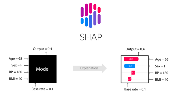
SHAP (Shapley Additive Explanations)
In 1951, Lloyd Shapley coined the term 'Shapley value' to describe the notion of finding solutions in cooperative games. To put things in context, game theory is a theoretical framework for dealing with scenarios in which there are competing players, and we are searching for the best options that rely on the strategy taken by the other players.
Mathematicians John von Neumann and John Nash, and economist Oskar Morgenstern, were the driving forces behind contemporary game theory. Shapley values deal with this specific scenario: When a group of players in a game uses a particular strategy to achieve a collective reward, we want to know how to distribute that reward fairly among them based on the individual contributions that each of those players made. This is where Shapley's values come in.
The SHAP (SHapley Additive exPlanations) package is a Python-based unified method for explaining the results of any machine learning model. Based on game theory and local explanations. Predictions may be made based on the presence or absence of a particular element using the game theory technique.
If the predicted result changes significantly, the factor greatly impacts the target variable.
Machine learning models' output may now be explained using a strategy that combines various approaches. It is possible to utilize SHAP for multiple models, except for time series models. The following commands are responsible for installing SHAP:
$ pip install shapOr using conda:
$ conda install -c conda-forge shapYou can find the documentation of SHAP here.
Source: SHAP on GitHub
LIME (Local Interpretable Model-Agnostic Explanations)
Local Interpretable Model-Agnostic Explanations is the acronym for LIME. The term "local" refers to the explanation of the class predicted by the model based on its location. The classifier's activity in the locale vicinity provides valuable insight into the predictions.
When we say a prediction is "interpretable", it implies that a human being can understand it. So, the class prediction must be understandable. Model agnostic means that the system and technique should generate the interpretations instead of requiring knowledge of a particular model type.
It's possible to demonstrate how LIME works using the Python library it's built on. We can set up the library via the following:
$ pip install limeYou can check the documentation here.
Source: Researchgate
ELI5 (Explain Like I'm 5)
ELI5 is a Python toolkit designed for an explainable AI pipeline that enables us to observe and debug diverse machine learning models with a uniform API. In addition to being able to describe black-box models, it includes built-in support for numerous ML frameworks.
This library was created to simplify the explanation of various black-box models. It is possible to install the Python version of ELI5 using:
$ pip install eli5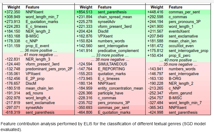
Source: Researchgate
Skater
We can develop an interpretable machine learning system using Skater. This open-source framework allows us to interpret all types of models. It offers techniques to demystify black box model learned structures globally (inference based on a whole data set) and locally (inference about an individual prediction). Here's how to set up Skater:
$ pip install skater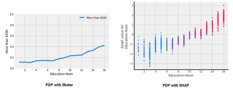 Source: Kdnuggets
XAI Compatible Models
Let's take a look at the present status of some of the AI models, their inherent nature, the degree to which they are compatible with XAI, and if these models need different frameworks for an explanation.
Time-series forecasting models: We can use a parametric approach to forecasting models, which follow a regression-like scenario.
Ensemble-based models: Ensemble models may be divided into three categories: bagging, boosting, and stacking. Model findings must be conveyed using a simple description, and the feature importance of each feature should be simplified.
Linear models: The coefficient value, which is a number, can easily be analyzed to comprehend linear or regression models. There is no difficulty in deciphering these numbers. The problem arises when we apply this to regularized regression families. We tend to emphasize the specific feature, and the interactivity features are not included. The model's complexity rises significantly if we incorporate additive, multiplicative, and polynomial-degree three-based interactions.
Tree-based models: It is much easier to understand and comprehend tree-based models. These models are not always superior at providing accuracy and performance, and they exhibit bias, overfitting, and a lack of robustness.
CNN models: In the eyes of many, this is a complete black box. Can we explain why the model predicted the cat as a dog if someone questions it? Gradient weighted Class Activation Mapping (Grad-CAM) localizes and highlights target areas in images by using gradients of a specific target that flow through the neural network. Grad-CAM has a wide range of applications in computer vision tasks such as image classification, object identification, semantic image segmentation, image captioning, visual question answering, etc. It also allows for the interpretation of the algorithm. You can read about it in this paper.
Bias in the Data
When we make predictions in different AI projects, we are often asked why someone would believe our model.
In predictive analytics, machine learning, or deep learning, there is a trade-off between what is predicted and why. Good predictions are those that are per human expectations. In cases when the model's decision goes against human expectations, we need to know why.
A low-risk situation like consumer targeting, digital marketing, or content suggestion is OK if predictions and expectation deviations occur. Many concerns may emerge as to why the model predicted this outcome in a context like clinical trials or a drug testing framework, where even the slightest divergence might significantly impact results. We may improve machine learning training by using an XAI framework to uncover the underlying biases. XAI helps us figure out why bias is occurring and where.
Bias in the algorithms
A portion of algorithmic bias results from data bias, which can't be eliminated during the training phase.
An incorrect model is trained, which results in an inaccurate forecast. We must produce a clear explanation of the predictions to eliminate biases in the training process and bias in the data.
The stakeholders must understand the expected model outcomes at the global and local levels. To explain the algorithm and data bias, the explainable AI platform and framework may give the appropriate framework, tools, and resources.
Process for Bias Correction
Governance has a critical role in reducing bias and improving ethical standards. Rules, norms, standards, procedures, and processes must regulate AI-based decision systems. Setting governance requirements, such as data review and thorough application testing, may help lessen the data's skewness.
Explaining Logistic Regression Model with SHAP
Logistic regression is often used to predict the probability of binary or multinomial outcomes. It can be multinomial (where more than two outcomes are possible). Class separation is complex in a multinomial class classification model.
A logistic regression model assumes a logarithmic relationship between the dependent and independent variables, while a linear regression model assumes a linear relationship. The variable of interest in many real-life settings is categorical: The purchase or non-purchase of a product, the approval or non-approval of a credit card, or the cancerousness of a tumor.
Logistic regression can estimate the likelihood of a case belonging to a specific level in the dependent variable. The logistic regression model can be explained using the following equation: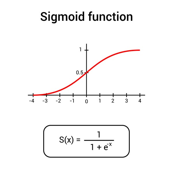
Source: DepositPhotos
The function described above is also known as a sigmoid function.
Source: quantifyinghealth
The formula gives the outcome's log odds Ln(P/1-P). The interpretation of a logistic regression model differs significantly from the interpretation of a linear regression model.
The right-hand side equation's weighted sum is turned into a probability value. The log odds are used to describe the value on the left side of the equation.
It is termed the log odds because it represents the ratio of an event occurring to the probability of an event not happening.
It is necessary to grasp the concepts of probabilities and odds to comprehend the logistic regression model and how decisions are made.
Getting Started with Code
![]()
We'll utilize Telecom_Train.csv, a dataset in the telecommunications category with 3,333 entries and 18 distinct features.
Let's install the dependencies:
$ pip install shap LIME interpret-core sklearnImporting the libraries:
import pandas as pd
import numpy as np
import matplotlib.pyplot as plt
%matplotlib inline
from sklearn.linear_model import LogisticRegression, LogisticRegressionCV, LinearRegression
from sklearn.metrics import confusion_matrix, classification_report
from sklearn.preprocessing import LabelEncoder
from sklearn.model_selection import train_test_split
import interpret.glassbox
import xgboost
import shap
import lime
import lime.lime_tabular
import sklearn
import warnings
warnings.filterwarnings('ignore')
As a first stage, you get the data, then convert specific features already in string format using a label encoder. You divide the data into 80 percent for training and 20 percent for testing following the transformation.
To keep the classes balanced, we maintain the percentage of churn and no-churn cases while generating the train/test split.
The model is then trained, and the trained model is applied to the test data:
data = pd.read_csv("Telecom_Train.csv")
data.head()
Performing some preprocessing:
del data['Unnamed: 0'] ## delete Unnamed: 0
le = LabelEncoder() ## perform label encoding
data['area_code_tr'] = le.fit_transform(data['area_code'])
del data['area_code'] ## delete area_code
data['churn_dum'] = pd.get_dummies(data.
churn,prefix='churn',drop_first=True)
del data['international_plan'] ## delete international_plan
del data['voice_mail_plan'] ## delete voice_mail_plan
del data['churn'] ## delete churn
data.info()
data.columns
<class 'pandas.core.frame.DataFrame'>
RangeIndex: 3333 entries, 0 to 3332
Data columns (total 18 columns):
# Column Non-Null Count Dtype
--- ------ -------------- -----
0 state 3333 non-null object
1 account_length 3333 non-null int64
2 number_vmail_messages 3333 non-null int64
3 total_day_minutes 3333 non-null float64
4 total_day_calls 3333 non-null int64
5 total_day_charge 3333 non-null float64
6 total_eve_minutes 3333 non-null float64
7 total_eve_calls 3333 non-null int64
8 total_eve_charge 3333 non-null float64
9 total_night_minutes 3333 non-null float64
10 total_night_calls 3333 non-null int64
11 total_night_charge 3333 non-null float64
12 total_intl_minutes 3333 non-null float64
13 total_intl_calls 3333 non-null int64
14 total_intl_charge 3333 non-null float64
15 number_customer_service_calls 3333 non-null int64
16 area_code_tr 3333 non-null int64
17 churn_dum 3333 non-null uint8
dtypes: float64(8), int64(8), object(1), uint8(1)
memory usage: 446.0+ KB
Index(['state', 'account_length', 'number_vmail_messages', 'total_day_minutes',
'total_day_calls', 'total_day_charge', 'total_eve_minutes',
'total_eve_calls', 'total_eve_charge', 'total_night_minutes',
'total_night_calls', 'total_night_charge', 'total_intl_minutes',
'total_intl_calls', 'total_intl_charge',
'number_customer_service_calls', 'area_code_tr', 'churn_dum'],
dtype='object')Let's divide the data into training and testing sets:
X = data[['account_length', 'number_vmail_messages', 'total_day_minutes',
'total_day_calls', 'total_day_charge', 'total_eve_minutes',
'total_eve_calls', 'total_eve_charge', 'total_night_minutes',
'total_night_calls', 'total_night_charge', 'total_intl_minutes',
'total_intl_calls', 'total_intl_charge',
'number_customer_service_calls', 'area_code_tr']]
Y = data['churn_dum']
xtrain,xtest,ytrain,ytest=train_test_split(X,Y,test_size=0.20,stratify=Y)
l_model = LogisticRegression()
l_model.fit(xtrain,ytrain)
print("training accuracy:", l_model.score(xtrain,ytrain)) #training accuracy
print("test accuracy:",l_model.score(xtest,ytest)) # test accuracy
training accuracy: 0.8589647411852963
test accuracy: 0.8515742128935532[[ 0. -0.02 0.02 0. -0.02 0.01 0. -0.02 0. 0. -0.02 0.08
-0.07 0.04 0.49 -0.02]]
[-8.53402363]Only the area code is transformed. The remaining features are either integers or floating-point numbers. It's now possible to see how a prediction is made by examining the distribution of probabilities, the log odds, the odds ratios, and other model parameters. SHAP values may reveal strong interaction effects when used to explain the likelihood of a logistic regression model.
The appropriate output may be generated using two new utility functions that you built and which can be used in a visual representation of SHAP values:
# Provide Probability as Output
def m_churn_proba(x):
return l_model.predict_proba(x)[:,1]
# Provide Log Odds as Output
def model_churn_log_odds(x):
p = l_model.predict_log_proba(x)
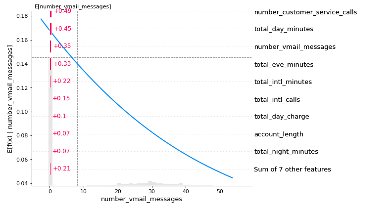
return p[:,1] - p[:,0]The partial dependency plot for the total feature day in minutes for record number 25 demonstrates a positive but not linear relationship between the function's probability value or predicted value and the feature:
# PDP
sample_ind = 25
fig,ax = shap.partial_dependence_plot(
"total_day_minutes", m_churn_proba, X, model_expected_value=True,
feature_expected_value=True, show=False, ice=False)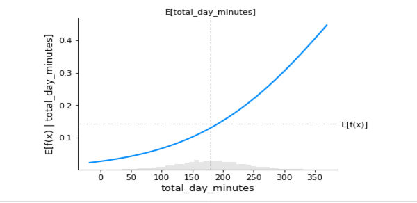
Any machine learning model or Python function may be explained using Shapley values. This is the SHAP library's explainer interface, and it accepts any model and masker combination and produces a callable subclass object that implements the selected estimate technique:
# SHAP values computation
background_c = shap.maskers.Independent(X, max_samples=1000) ## Concealed features may be hidden by using this function.
explainer = shap.Explainer(l_model, background_c,
feature_names=list(X.columns))
shap_values_c = explainer(X)
shap_values = pd.DataFrame(shap_values_c.values)
shap_values.columns = list(X.columns)
shap_values
The below plot shows a strong, perfect linear relationship between account length and SHAP values of account length in the scatterplot:
shap.plots.scatter(shap_values_c[:,'account_length'])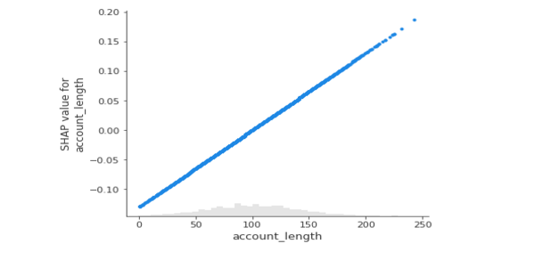
The below plot shows which feature is more critical in the classification. Customers with more complaints are more likely to call customer service and can churn anytime. Another factor is the total day in minutes, followed by the number of voicemail messages. Towards the end, the seven most minor significant features are grouped.
The maximum absolute SHAP value for each feature is shown below; however, the two graphs are similar. A beeswarm graphic displays the SHAP value and its influence on model output. The heatmap display of SHAP values for hundreds of records illustrates the SHAP value density versus model features. The best feature has a high SHAP value, while the feature importance and SHAP value decline with time.
The plot below illustrates how a SHAP bar plot will use the mean absolute value of each feature (by default) across all dataset occurrences:
shap.plots.bar(shap_values_churn_l)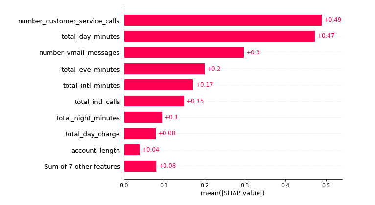
The below plot illustrates how using the maximum absolute value highlights the number_customer_service_calls, which have a significant impact:
shap.plots.bar(shap_values_churn_l.abs.max(0))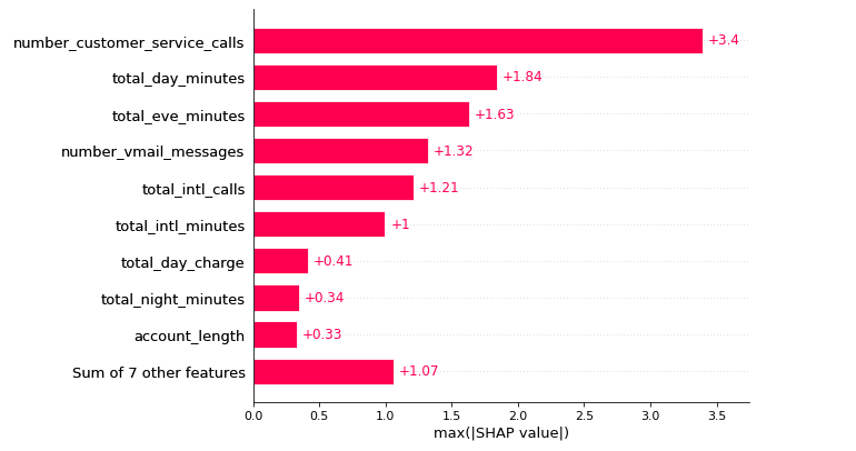
Below, we can see the beeswarm plot that can be used to summarize the whole distribution of SHAP values for each feature.
The dot's location on the x-axis indicates whether that attribute contributed positively or negatively to the prediction.
This allows you to quickly determine if the feature is essentially flat for each forecast or significantly influences specific rows while having little impact on others:
shap.plots.beeswarm(shap_values_churn_l)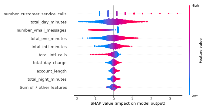
The below plot represents the frequency with which each feature gave SHAP values for instances utilized in the training procedure:
shap.plots.heatmap(shap_values_churn_l[:1000])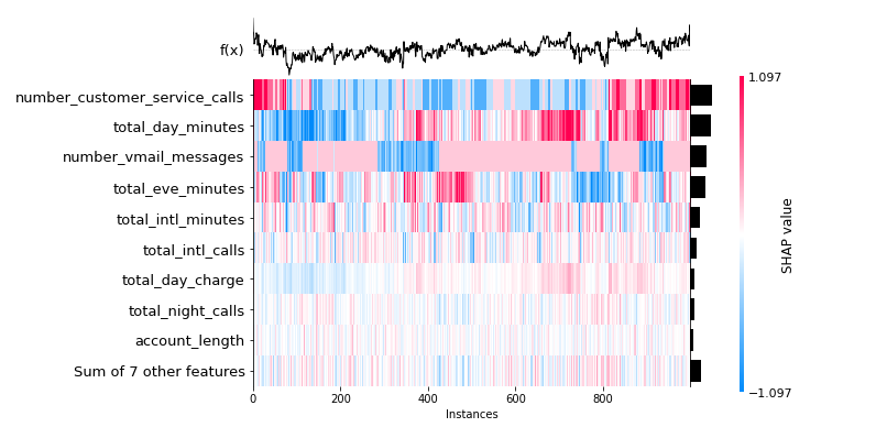
Using LIME to Explain Logistic Regression
The SHAP values can be used to explain the logistic regression model. But the main problem here is time.
With a million records, you need more time to construct all permutations and combinations to explain the local accuracy.
LIME's explanation generation speed avoids this issue in huge dataset processing. The work discussed in this paper served as the foundation for LIME. To be more specific, the procedure is as follows:
- Choose the instance of interest for which you would like to learn about its black box forecast.
- Perturb the dataset to get black box predictions for these additional points.
- Weight the new samples based on their proximity to the point of interest.
- On the dataset with the variations, train a weighted, interpretable model.
- Interpret the local model to explain the forecast.
LIME includes three primary functionalities:
- The image explainer interprets image classification models.
- The text explainer gives insight into text-based models.
- The tabular explainer determines how much a tabular dataset's features are evaluated throughout the classification process.
Lime Tabular Explainer is required to explain tabular matrix data. The term "local" refers to the framework's analysis of individual features. It does not provide a comprehensive explanation for why the model performs but instead describes how a given observation is classified. The user should be able to grasp what a model performs if it is interpretable.
Thus, while dealing with image classification, it reveals which parts of the image it evaluated when making predictions. When working with tabular data, it shows which features influence its choice. Model-agnostic means that it may be used for any black box algorithm that exists now or is developed in the future. The explainer itself is part of the LIME library:
xtrain: Training set.feature_names: List of all feature names.class_names: Target values.
explainer = lime.lime_tabular.LimeTabularExplainer(np.array(xtrain),
feature_names=list(xtrain.columns),
class_names=['churn_dum'],
verbose=True, mode='classification')
# this record is a no churn scenario
expl = explainer.explain_instance(xtest.iloc[0], l_model.predict_proba,
num_features=16)
expl.as_list()
Intercept 0.13450281288883145
Prediction_local [0.12044335]
Right: 0.09223383549190349
X does not have valid feature names, but LogisticRegression was fitted with feature names
[('number_customer_service_calls <= 1.00', -0.11027230858253914),
('total_eve_minutes > 235.00', 0.086554391062915),
('number_vmail_messages <= 0.00', 0.08154504727552693),
('total_intl_minutes <= 8.50', -0.04700043074600281),
('143.20 < total_day_minutes <= 179.50', -0.036772950487332035),
('total_intl_calls <= 3.00', 0.0329635855218514),
('total_eve_charge > 19.98', -0.011221798124476417),
('24.34 < total_day_charge <= 30.52', -0.007301244935610678),
('total_intl_charge <= 2.30', -0.004777921020182704),
('201.40 < total_night_minutes <= 236.17', 0.004772023372329833),
('9.06 < total_night_charge <= 10.63', -0.002869284931577161),
('101.00 < account_length <= 127.00', 0.0028660554943722026),
('101.00 < total_day_calls <= 114.00', -0.002464984943441803),
('area_code_tr > 1.00', 0.0017820878937738894),
('100.00 < total_night_calls <= 113.00', -0.001761431119969434),
('100.00 < total_eve_calls <= 114.00', -0.00010029647263749231)]Once the explainer model object is created, you may construct explanations by checking for individual and global predictions. In classification with two or more classes, you may produce different feature importances for each class in relation to the features column:
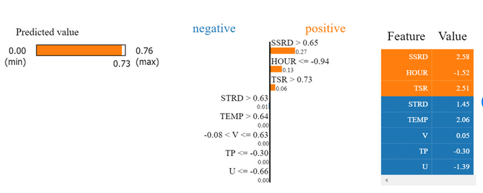
pd.DataFrame(expl.as_list())The code produces the LIME output divided into three sections: prediction probabilities on the left, feature probabilities in the middle, and a feature-value table on the right. A graph of prediction probabilities indicates what the model thinks will happen and the related likelihood. There is a 91% chance that the customer will not churn, which is represented by the blue bar, and a 9% chance that he will churn, which is represented by the orange bar.
The feature probability graph illustrates how much a feature impacts a specific choice. The variable number_customer_service_calls is the most influential component in this observation. The last graph is the feature value table which displays the actual value of this feature in this observation.
expl.show_in_notebook(show_table=True)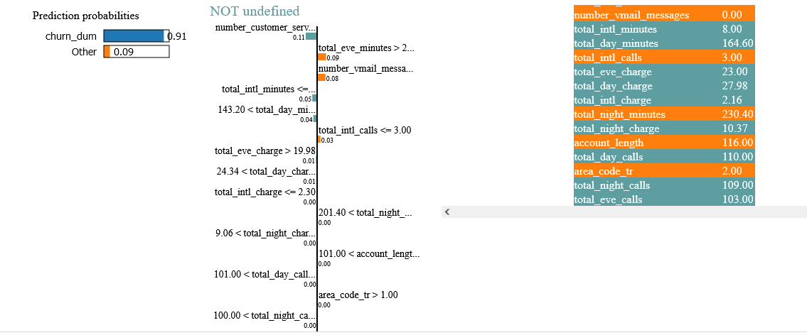
Although LIME is simple and effective, it is not without flaws. It depends on locally created fictitious data and employs linear models to explain predictions. It was published in 2020, and the first theoretical examination of LIME has confirmed its importance and relevance. But it also shows that poor parameter selections might cause LIME to overlook important features.
Consequently, different interpretations of the same prediction may lead to deployment issues. DLIME, a deterministic variant of LIME, is suggested to overcome this uncertainty. Hierarchical clustering is used to group the data, and k-nearest neighbors (KNN) pick the cluster where the instance in question is thought to reside.
Example of Nonlinear Model: Decision Tree Models
In a decision tree, the independent variable is nonlinearly linked to the dependent variable.
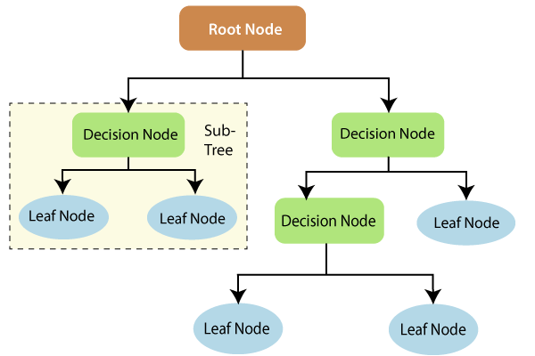
This may seem to be a piece-wise linear regression on the local level. But, from a global perspective, this is a nonlinear model since the dependent and independent variables do not have a one-to-one correspondence. For example, no mathematical equation demonstrates how the input and output variables are related. The figure below represents the decision tree's anatomy.
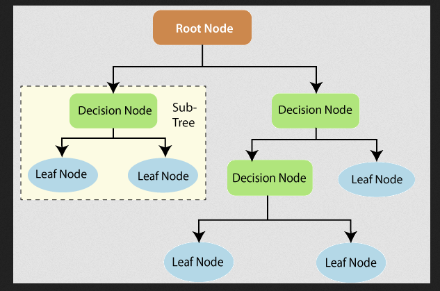
Source: https://www.tutorialandexample.com/wp-content/uploads/2019/10/Decision-Trees-Root-Node.png
The terminal nodes are the nodes at which the five construction ends. The average result of the whole data is used to predict the outcome of a specific record.
Iterative Dichotomiser 3 (ID3) is the most used decision tree algorithm; however other algorithms like C4.5, CART, MARS, and CHAID are also used. It is based on the following steps:
- The best attribute or feature must be identified from the dataset and placed at the tree's root to build a tree.
- Creating subsets of the training dataset with the same value for an attribute or feature.
- Repeating the following two stages to divide all classes into one node or meet a minimum number of samples in the node.
The tree's root is used to forecast a record's class label in the decision tree models. The root attributes are compared, and the better one is used at the beginning of the decision tree. In terms of model explainability, the predictions made by a decision tree can be explained reasonably well. The decision tree offers a set of rules that any program may use.
Decision Tree Explanation
There are two techniques to achieve model explainability: The XAI library and the basic ML library.
With the parent ML library, we can utilize an existing trained model, and if we use the XAI library, we will need to train the ML model again. However, the end-user benefits from having a readily accessible model and being able to provide model explanations.
You can check this tutorial for more intéresting facts. Nonlinear models are easier to interpret, and everyone knows how they behave using simple if/then principles. As a result, there is a high confidence level in tree-based nonlinear models.
Explainability for Ensemble Models
In an ensemble model, the predictions from a set of models are combined to provide a single forecast.
The final result is derived from an average of the predictions made by each of the trees. Classification models make individual class predictions and then similarly adopt a voting rule.
The final output is taken from the class with the highest number. End-users have a hard time understanding and deciphering ensemble models.
Explaining why specific models predicted "yes" to the end-user is challenging. Thus, it is critical to explain the ensemble models.
Throughout this section, you'll use SHAP primarily to explain the predictions of ensemble models.
Using SHAP for Ensemble Models
We will use the popular Boston housing prices dataset to explain the model predictions in a regression use case scenario. The description of the features can be found on this website.
The SHAP library now includes the Boston housing prices dataset.
The linear regression model is used to compute the base model so that the ensemble model may be applied to this dataset and compared to the results:
# boston Housing price
X,y = shap.datasets.boston()
X1000 = shap.utils.sample(X, 1000) # 1000 instances for use as the background distribution
# a simple linear model
m_del = sklearn.linear_model.LinearRegression()
m_del.fit(X, y)
The starting point is a model's coefficients.
We'll then compare the coefficients in the complex ensemble models to those in the linear base model.
We compare the explanations. Improved explainability is directly proportional to increased accuracy in prediction.
print("coefficients of the model:\n")
for i in range(X.shape[1]):
    print(X.columns[i], "=", m_del.coef_[i].round(4))
coefficients of the model:
CRIM = -0.108
ZN = 0.0464
INDUS = 0.0206
CHAS = 2.6867
NOX = -17.7666
RM = 3.8099
AGE = 0.0007
DIS = -1.4756
RAD = 0.306
TAX = -0.0123
PTRATIO = -0.9527
B = 0.0093
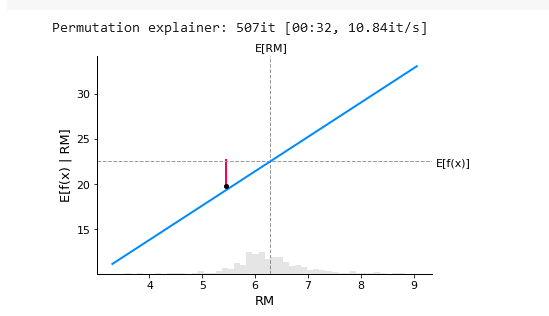
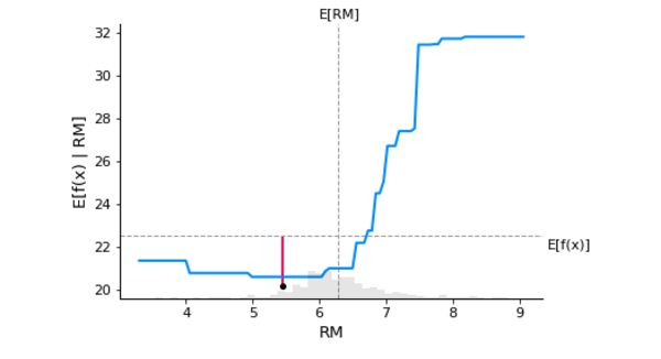
LSTAT = -0.5248You may see the predicted median value of the housing price by looking at the horizontal dotted line E[f(x)]. There is a linear relationship between the RM feature and the model's predicted outcome.
shap.plots.partial_dependence(
"RM", m_del.predict, X1000, ice=False,
model_expected_value=True, feature_expected_value=True
)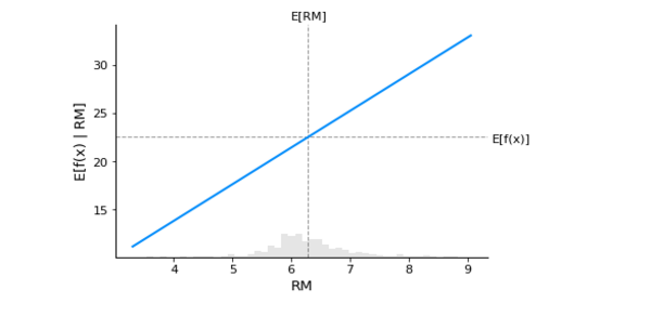
From the below plot, we can see that row number 18 from the dataset is superimposed on the PDP plot. An upward-rising straight line illustrates RM's marginal contribution to the predicted value of the target column.
The discrepancy between the expected value and the average predicted the red line shows the value in the graph. A partial dependency plot can reveal whether the target's and features' relationship is linear, monotonic, or complex.
# SHAP values computation for the linear model
explainer1 = shap.Explainer(m_del.predict, X1000)
shap_values = explainer1(X)
# PDP
sample_ind = 18
shap.partial_dependence_plot(
"RM", m_del.predict, X1000, model_expected_value=True,
feature_expected_value=True, ice=False,
shap_values=shap_values[sample_ind:sample_ind+1,:]
)
X1000 = shap.utils.sample(X,100)
m_del.predict(X1000).mean() ## mean
m_del.predict(X1000).min() ## minimum
m_del.predict(X1000).max() ## maximum
shap_values[18:19,:] ## shap values
X[18:19]
m_del.predict(X[18:19])
shap_values[18:19,:].values.sum() + shap_values[18:19,:].base_valuesarray([16.17801106])The predicted outcome for record number 18 is 16.178, and the total of the SHAP values from various features and the base value is equal to the predicted value.
From the below plot, SHAP values are generated using a linear model, which explains why the relationship is linear. You can expect the line to be nonlinear if you switch to a nonlinear model.
shap.plots.scatter(shap_values[:,"RM"])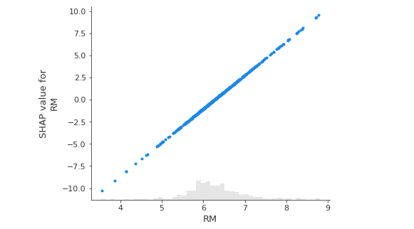
The plot below displays the relationship between the predicted result and SHAP values:
# the waterfall_plot
m_del.predict(X)[sample_ind]
shap.plots.waterfall(shap_values[sample_ind], max_display=13)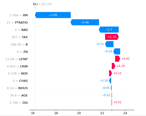
The horizontal axis in the figure above displays the predicted average result value, which is 22.841, while the vertical axis shows the SHAP values from different features.
The dataset's presumed values for each feature are represented in grey, while the negative SHAP values are shown in blue, and the positive SHAP values are shown in red. The vertical axis also shows the predicted result for the 18th record, which is 16.178.
Using the Interpret Explaining Boosting Model
This section will utilize generalized additive models (GAM) to forecast home prices.
The interpret Python package can be used to train the generalized additive model, and the trained model object can then be sent through the SHAP model to provide explanations for the boosting models. There are three methods to install the interpret library:
Using the pip install method, this is done without any dependencies:
$ pip install interpret-coreUsing Conda:
$ conda install -c interpretml interpret-coreOr you can get this directly from the source:
$ git clone https://github.com/interpretml/interpret.git && cd interpret/scripts && make install-coreThe interpret Python library supports two types of algorithms:
- Glassbox models: Glassbox models are designed for direct interpretability, meaning that the explanations are precise and human-interpretable. Linear models, decision trees, decision rules, and boosting-based models are all supported.
- Blackbox explainers: An approximate explanation of the model's behavior and predictions are provided by blackbox explainers.
These approaches may be used when none of the machine learning model's components can be interpreted.
These methods support shapely explanations, LIME explanations, partial dependency plots, and Morris sensitivity analysis.
First, import the glassbox module from interpret, then set up the explainable boosting regressor and fit the model:
# fit a GAM model to the data
m_ebm = interpret.glassbox.ExplainableBoostingRegressor()
m_ebm.fit(X, y)
ExplainableBoostingRegressor(feature_names=['CRIM', 'ZN', 'INDUS', 'CHAS',
'NOX', 'RM', 'AGE', 'DIS', 'RAD',
'TAX', 'PTRATIO', 'B', 'LSTAT',
'DIS x LSTAT', 'DIS x B',
'CRIM x LSTAT', 'RM x TAX',
'AGE x LSTAT', 'NOX x RM',
'RM x RAD', 'NOX x LSTAT',
'INDUS x LSTAT', 'CRIM x RM'],
feature_types=['continuous', 'continuous',
'continuous', 'categorical',
'continuous', 'continuous',
'continuous', 'continuous',
'continuous', 'continuous',
'continuous', 'continuous',
'continuous', 'interaction',
'interaction', 'interaction',
'interaction', 'interaction',
'interaction', 'interaction',
'interaction', 'interaction',
'interaction'])We will sample the training dataset to provide a backdrop for creating explanations using the SHAP package. In the SHAP explainer, we use m_ebm.predict(), and some samples to construct explanations:
# GAM model with SHAP explanation
expl_ebm = shap.Explainer(m_ebm.predict, X1000)
shap_v_ebm = expl_ebm(X)
Permutation explainer: 507it [01:10, 6.10it/s]# PDP with a single SHAP value
fig,ax = shap.partial_dependence_plot(
"RM", m_ebm.predict, X, feature_expected_value=True, model_expected_value=True, show=False,ice= False,
shap_values=shap_v_ebm[sample_ind:sample_ind+1,:]
)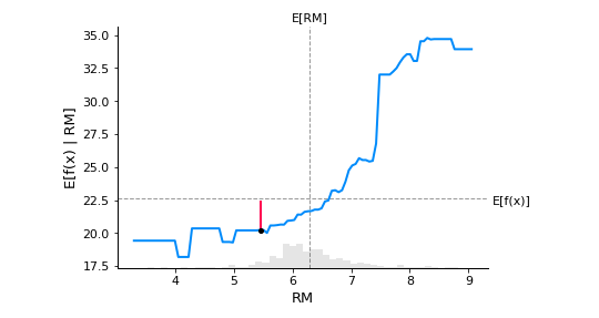
The boosting-based model is shown above. There is a nonlinear relationship between the RM values and the forecasted target column, which is the average value of housing prices. As the red straight line indicates, we're explaining the same 18th record once again:
shap.plots.scatter(shap_v_ebm[:,"RM"])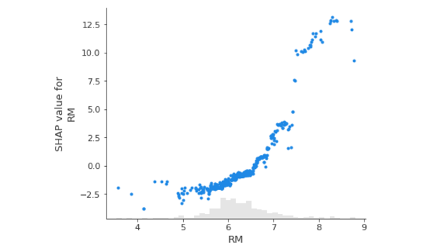
The relationship shown in the graph above is nonlinear. At the start, the predicted value does not grow significantly as the RM increases. Still, beyond a particular stage, the SHAP value for RM climbs exponentially as the RM value increases.
We see a nonlinear relationship in the below figure, where the extreme gradient boosting regression model is applied to explain ensemble models:
# XGBoost model training
m_xgb = xgboost.XGBRegressor(n_estimators=100, max_depth=2).fit(X, y)
# the GAM model explanation with SHAP
expl_xgb = shap.Explainer(m_xgb, X1000)
shap_v_xgb = expl_xgb(X)
# PDP with a single SHAP value
fig,ax = shap.partial_dependence_plot(
"RM", m_ebm.predict, X, feature_expected_value=True, model_expected_value=True, show=False,ice= False,
shap_values=shap_v_ebm[sample_ind:sample_ind+1,:]
)
A nonlinear relationship between RM and the SHAP value of RM is seen in the figure below:
shap.plots.scatter(shap_v_xgb[:,"RM"])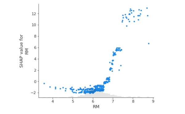
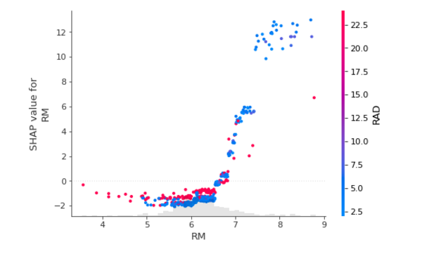
The graph below depicts the same nonlinear relationship with an extra overlay of the RAD feature, demonstrating that the higher the RM value, the higher the RAD component, and vice versa:
shap.plots.scatter(shap_v_xgb[:,"RM"], color=shap_values)
Conclusion
We discussed a regression model based on a boosting model. We may train bagging classifiers similarly, and comparable graphs can be generated as output. The graphs will not change, but the interpretation of the values will differ as you move between models.
With a regression model, we can predict the value of the target column and see how that value changes over time. As a result, if we modify an input feature, we can see how it affects the intended output. We may build a comparable PDP framework to understand the model's decision-making, whether boosting, bagging, or stacking. However, the pattern exhibited in a PDP plot will change.
This tutorial focuses on model interpretability and explainability. It starts with an overview of model explainability and interpretability fundamentals, AI applications, and biases in AI model predictions. We looked at utilizing SHAP and LIME to explain a Logistic Regression model and how to explain and interpret an ensemble model.
We also spoke a bit about Decision Tree Explanation. Communicating AI models in clear, straightforward language will take some time for corporate users. Perhaps a new framework will emerge to handle this.
The current challenge is that the data scientist who builds the model lacks comprehensive knowledge of the model's behavior and cannot explain the AI model well. I hope this guide was helpful!
Learn also: Handling Imbalanced Datasets: A Case Study with Customer Churn.
![]()
Happy learning ♥
Finished reading? Keep the learning going with our AI-powered Code Explainer. Try it now!
View Full Code Assist My Coding


Got a coding query or need some guidance before you comment? Check out this Python Code Assistant for expert advice and handy tips. It's like having a coding tutor right in your fingertips!