Get a head start on your coding projects with our Python Code Generator. Perfect for those times when you need a quick solution. Don't wait, try it today!
In this tutorial, we will make an interactive Matplotlib Line Graph showing a city's temperatures for the next seven days. So we will learn about matplotlib.widgets, and about requests because we use the open-meteo.com API for our data. We're also using the json module so we can read the response data.
To get started, let's import the necessary libraries:
$ pip install requests matplotlib seabornWe'll be using seaborn for automatic styling. Open up a new Python file to follow along, and import the following:
import matplotlib.pyplot as plt
from matplotlib.widgets import RadioButtons
import seaborn
seaborn.set_style("darkgrid")
import requests
import json
Locations
After the imports, we define some locations from which the user can choose. The API we will use only accepts WG84 coordinates and not place names.
So we look up some places and their coordinates and insert them into a dictionary where the key is the place's name, and the value is a two-item list with the latitude and longitude. You can extend this Python dictionary if you want:
# Define some Locations to choose from.
# Latitude and Longitude
locations = {
    'Schaffhausen': ['47.7', '8.6'],
    'Sydney': ['-33.86', '151.20'],
    'Kyiv': ['50.4422', '30.5367'],
    'Constantine': ['36.368258', '6.560254'],
    'Yakutsk': ['62.0', '129.7'],
}
You can also use geocoding to automatically get the latitude and longitude from a city name; this tutorial should help.
Matplotlib Setup
Now let's set up matplotlib. For this, we call the subplots() function and save the two items it returns in two variables. We usually use this function if we want multiple axes. The fig variable holds info about the whole thing, and the ax contains information about one plot. Then we define a variable p that will store the plot info of our single plot:
# Setting Up Matplotlib, using the OOP Approach
fig, ax = plt.subplots()
# the plot is created with the first location
p = None
Get Temperatures Function
In the below function, we use the requests library to get the data from open-meteo.com free API, and then parse it using the json module and return the times and temperatures:
# make a function to get the temperatures of a given location
def getTemperatures(location):
    # get the lat and long of the location
    lat, lon = locations[location]
    req = requests.get(f'https://api.open-meteo.com/v1/forecast?latitude={lat}&longitude={lon}&hourly=temperature_2m')
    req = json.loads(req.text)
    # get the tempratures
    temperatures = req['hourly']['temperature_2m']
    # get the times
    times = req['hourly']['time']
    return times, temperatures
We can request that URL with the get() method from requests. We parse the JSON data from there to a valid Python dictionary with the json.loads() function. Here you can see what such a request could look like.
Downloading & Storing the Data
Let's make a Python dictionary that stores the location and its corresponding times and temperatures:
# Make a dictionary with the locations as keys and the getTemperatures() function as values
location2data = {}
for location in locations:
    location2data[location] = getTemperatures(location)
Change Location Function
Now let's get to the function that will change the location we are currently showing. The buttons will call it, and this connection will pass the name of the button to the function, and this name will be the new desired location. We also get the global p variable we defined earlier:
def changeLocation(newLocation):
    global p
Next, we simply use location2data to get the times and temperatures of the passed location:
    # get the data of the location from the dictionary
    times, temperatures = location2data[newLocation]
After getting the data, we check whether p is not None and if that's the case, we set the data to our newly found temperatures value and refresh the plot:
    if p:
        p.set_ydata(temperatures)
        # reflect changes in the plot
        plt.draw()
If p is not defined, we have to make it first. To do this, we use the plot() method on ax. We give it the times list as an x-axis, and we make a list comprehension for the y-axis. We also set a line style with ls, a linewidth with lw.
This function will make the plot and return a list of each line. We get the first and only item from there and save it to p:
    else:
        # Make a Plot and save the first object to a variable
        # p will be a Line2D object which can be changed at a later time
        p = ax.plot(times, temperatures, ls=':', lw=3)[0]
Now we also edit the sticks because they won't be nice with 168 data points. For this, we start by making a list where seven numbers of 24 (hours) apart from each other are chosen:
        # set the x-axis to the times
        xRange = list(range(0, 168, 24)) + [168]
        ax.set_xticks(xRange)
Setting the y axis for the temperatures as well:
        # set the y-axis to the temperatures
        yRange = list(range(-20, 55, 5))
        ax.set_yticks(yRange)
Now last but not least, we also set the label color and rotation for these tick labels with the tick_params method.
plt.tick_params(axis="both", which='both', labelrotation=-10) # rotate the labelsIn all cases, we update the title to reflect the current location. We can do this on the fly. And after the function is defined, we call it with a starting location, so the plot is not empty:
    # set the title
    ax.set_title('Temperatures in ' + newLocation)


# Call the change Location function for the first time
changeLocation('Schaffhausen')
Setup Radio Buttons
Now we make some radio buttons. To do this, we simply call the RadioButtons() class, and we provide it with a position that is represented by the axes, and we give the location names as a labels argument.
# Making the Radio Buttons
buttons = RadioButtons(
    ax=plt.axes([0.1, 0.1, 0.2, 0.2]),
    labels=locations.keys()
)
Then we need to also connect the clicked event of these buttons to our function.
# Connect clicked event to function.
buttons.on_clicked(changeLocation)
We also adjust the position of the plot, so there is room for the radio button panel.
# adjust the plot size
plt.subplots_adjust(left=0.1, bottom=0.40)
Labels and showing the plot
In the end, before we show the plot, we also give the x and y axis a label and color them.
# Label the Plot
ax.set_xlabel('Times [Next Seven Days]')
ax.xaxis.label.set_color(labelColor)
ax.set_ylabel('Temperatures [Celcius]')
ax.yaxis.label.set_color(labelColor)
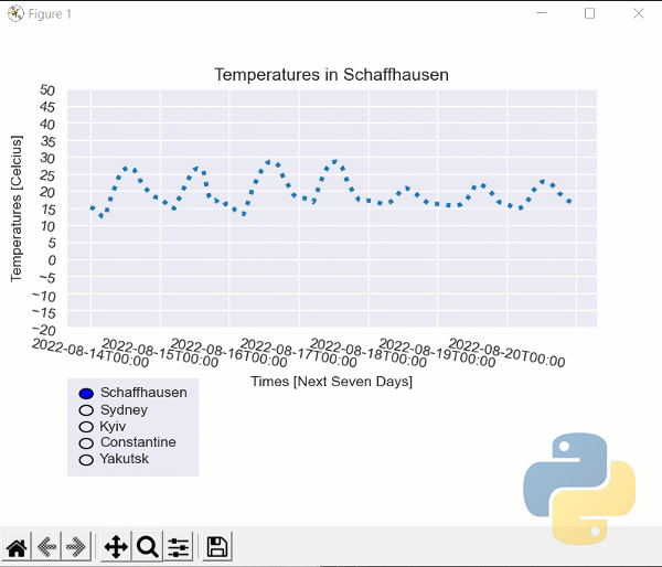
plt.show()Showcase
Below you see our little program in action. It's getting hot in Constantine!
Conclusion
Excellent! You have successfully learned to:
- Create an interactive plot using matplotlib.
- Make simple HTTP GET requests to open-meteo.com API.
See how you can add more features to this program, such as an Entry field for latitude and longitude or automatically getting the coordinates from the city name; this tutorial should help you.
You can always get the complete code for this tutorial here.
Learn also: Zipf's Word Frequency Plot with Python.
Happy coding ♥
Loved the article? You'll love our Code Converter even more! It's your secret weapon for effortless coding. Give it a whirl!
View Full Code Switch My Framework


Got a coding query or need some guidance before you comment? Check out this Python Code Assistant for expert advice and handy tips. It's like having a coding tutor right in your fingertips!